Trade Show Tips and Tricks from IGE Group —
How to Make an Impression with Your Trade Show Messaging

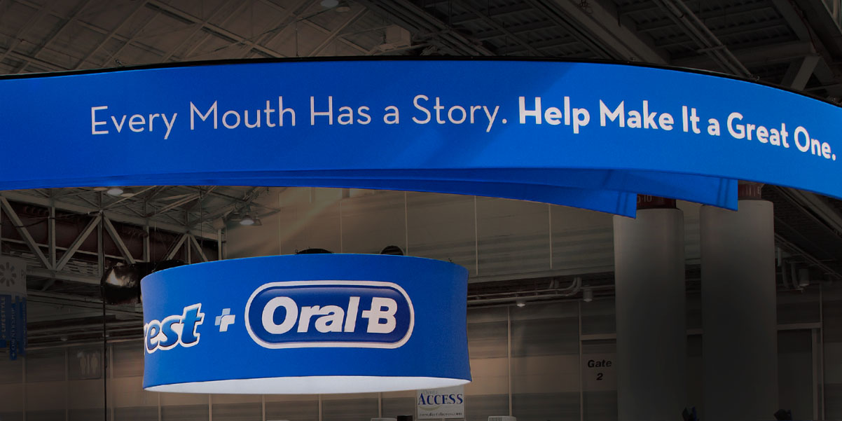
Many exhibitors spend a lot of time on the visual elements of their trade show signage, but they don’t give much thought to the messaging. The best trade show graphics combine visual aesthetics and great brand messaging that speak to a highly targeted audience. Your brand messaging refers to the message you send as well as the fonts and typefaces you use.
Below we share the best ways that you can put your trade show graphics to good use and capture the right audience.
Apply the Right Tone of Voice
Your brand’s voice should remain consistent, but your tone can change. Because you are exhibiting at a trade show event with lots of attendees, it’s best to choose a tone that is warm, friendly and inviting. Still, consider your audience and the type of messaging they expect from you. Does your audience expect you to be funny and playful? Or do they expect you to be serious and fact-based?
Speak to a Targeted Audience
Your job is to attract the right people to your trade show exhibit design, so you must use messaging that speaks to them. To write prospect-centric messaging, review your buyer personas. What do your buyers want? What problems are they trying to solve? Why are your products and services the solution? The more specific your messaging is, the more it will stand out to the right people.
Separate Yourself from the Competition
Businesses and organizations attend trade shows because they give them a unique opportunity to meet with customers face to face. Make the most of this time by creating messaging that is unique from your competition. How can you be bolder? More engaging? You don’t want to confuse your audience, but you do want to set yourself apart from your competitors.
Choose Clean, Simple Fonts
Select simple, easy to read lettering that can be seen from near or far for your trade show booth graphics. Visitors shouldn’t have to struggle to read your trade show booth messaging, which can happen if you choose the wrong fonts or use too many fonts. A few font tips for your trade show signage are:
- Use 1-3 fonts for maximum readability
- Choose colors that coordinate with your typeface
- Use lines, circles or boxes to draw attention to text
- Leave white space between letters for easier readability
- Use standard fonts – unique ones can be difficult to read
Pay Attention to Color
Your color scheme should align with your brand colors and personality while also enhancing your messaging. When choosing a color scheme, keep in mind that the colors used will influence people’s emotions. We recommend reading this article on color psychology. Strive for color harmony by matching the colors of your subtler elements with those on your prominent components.
When creating signage for your custom trade show booth, be sure that you pay attention to the messaging. This is what speaks to your audience and starts a customer-brand relationship on the trade show floor. For more ideas on how to speak to your target audience through your trade show exhibit, contact IGE today.